Digital comics; what’s not to love? The colors are beautiful, the price (usually) can’t be beat, you can shove a stack of mid-’80s Justice League Internationals weightlessly into your tablet and bring them with you on the bus, and you can re-download everything later when you lose your tablet on that bus. But what’s up with guided view?
Reading a comic in guided view is like watching a flip book; each panel is essentially cut out of the page and pasted into its own page of a scrapbook. One has the option of ordering the “camera” to pull back at the end of a page so the entire thing can be viewed as it was meant to before jumping back in to the out-of-context single panel reading. Comixology’s version of the trick is particularly advanced (and apparently trademarked), occasionally allowing the panel to pan left or right so as to read multiple actions in a single panel in the proper order. I sometimes double-click into guided view because it makes a perfectly sized zoom for me when I want to inspect a Geof Darrow background for a couple hours. Otherwise, it renders pointless all the hard work that went in to designing the comic book page.
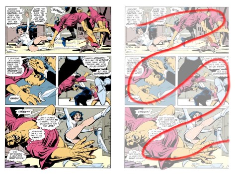
But don’t take my word for it, take the word of Wonder Woman #201, recently reprinted in DC’s Retroactive series this summer. If you can look past WW’s hip-hugging ’70s action suit and her battle with Tibetan samurai warriors plus Catwoman while suspended over a fiery death trap for just a moment and take a look at the underlying craft with me, you’ll notice that artist Dick Giordano and letterer John Constanza seem to have momentarily occupied the same brain while laying out these pages. With the efficency of the comics art master he was, Giordano carefully ensures that art within each panel leads the reader to the next one, the angles of limbs and buildings, mountain passes and flames all leaning towards the next action in the kind of swooping internal guided view that subconsciously trained a generation of artists in the unique visual language of comics. Costanza, making me sob jealously, follows Giordano’s lead, keeping his balloons and connecting tails in almost perfect lockstep with those angles while still managing to stay out of the way.
Here’s just one page, with my completely unnecessary red line highlighting its fluid design:
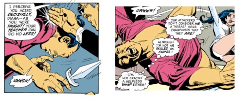
Now, here are some panels from the page as seen in Guided View:
When part of the full page, the assailant’s dagger in Panel 2 points right to where your eye should go next in Panel 3: up the line of Diana’s leg to Costanza’s next balloon. In guided view, the dagger’s point is chopped off and you have no idea that there’s something immediately next to it that should be seen right away.
In Panel 3, the downward slope of Diana’s right leg leads you to her kicking action in Panel 4, where Giordano helpfully has her kicking leg stabbing up into the previous panel so your eye can more easily pick it up. Following along from here, you read down and left along the kicking leg, over to her thought balloons placed across the poor guy she just clobbered, then along his outstretched arm back to the right-hand side of the panel to the next page. This is what we call, “Pure Design Brilliance” or sometimes, “Come On, How Are We Supposed to Live Up to That?” here at Letter Better. In guided view, this effect is entirely destroyed: the next important thing to see after Panel 3, according to the GV Bot, is the left-most part of Panel 4, meaning just her word balloons, none of her kicking leg, and none of the thug’s outstretched arm.
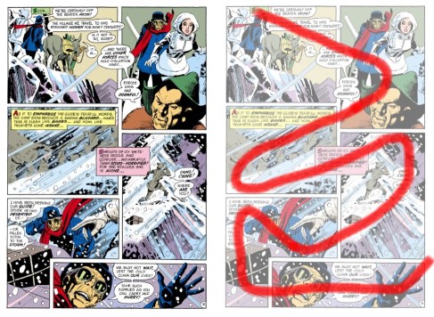
Here’s what might be the best page in the story, lettering and design-wise:
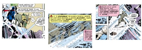
The panel layout itself is certainly easy to read, but it’s supremely helped by Costanza’s excellent caption and balloon placement. Captions overlapping panels can ruin a narrative if done wrong, but he does it right, using the captions to create a flowing voiceover feel. How does guided view navigate through it? By chopping the captions out of their panels entirely, and splitting word balloons in half:
Reading these lonely chopped up bits of text is, how shall I put it? Joyless?
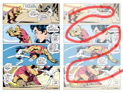
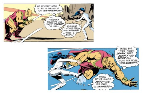
And here’s one more, a simple and elegant one-on-one fight scene with smooth angle-switching through expert draftsmanship:
The swords, the slice effects, and of course, Costanza’s balloons, all lead you through this page’s S-curve. In guided view? More like a John Woo fight now. The panels are beautiful by themselves, but now they’re still images instead of slow-mo blurs in a whirling sequence:
I’ve heard some good things about guided view, mainly that it can keep the panel- and page-turn surprises intact. But a comics page is an art form; cutting it up turns it into something else.

Wow, I didn’t know comic apps were doing this. Page layout is one of the most interesting aspects of comic art. It’s been years since I read one of Scott McCloud’s books, and I still remember his explanation of depicting time with comic frames.
Definitely, a comics page is a singularly beautiful thing. Though I wonder if cartoonists 100 years from now will abandon it and make their comics exclusively for reading on phones! Likely.
Pingback: Do You Really Need to Guide My View? | The Graphic Novel